Wednesday, June 29, 2011

6/29 Thoughts on Designing the 5th Wall (Ceiling Treatments)

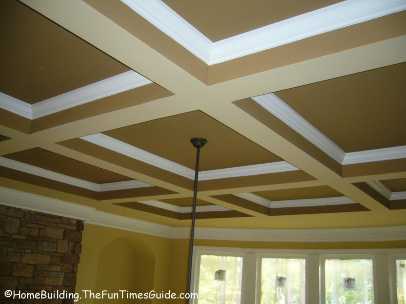
Ceilings are often overlooked as a design element in a room.  Rather than ignore it and provide the default white drywall ceiling one should approach a room's ceiling as another surface that can help define the room and to the add to the room's aesthetic.  Possible ceiling treatments include moldings, trim, medallions, light fixtures, paint, textured finishes, skylights, trellis, exposed beams, bulkheads and coffers and the use of diverse surface materials such as wood planking, perforated metal panels, stamped tin, panels wrapped in fabric, draped fabric, and clerestory windows.


Glistening tin ceiling adds another dimension to room.


Coffered ceiling creates depth instead of the normal flat surface.


Recessed lighting and color used to turn ceiling into a major design element.

False ceiling designs collections

Vaulted ceiling used to provide depth and a visual contrast with the, of necessity, plain gallery walls.


Wood planked ceiling mirrors the wood floor and helps create the enclosed feeling of a room despite the lack of a wall on the right.

Monday, June 20, 2011

6/27: When I Began Loving Interior Design

Although I can't honestly say that I "love" Interior Design, I am very interested in it and want to become a lot more proficient in it.  I registered at the last minute (on the first day of classes) for an Interior Design course when a CAD course I signed up for got cancelled.  The course (Material and Methods for Interior Design), which I signed up for on a whim, turned out to be very interesting.  For the first time I was spending a lot of time selecting interior surface materials and colors.  The challenge was to not only select materials suitable for the intended uses of the surfaces but to select colors that would create a pleasing and appropriate palette for the space.  I have continued this exploration with a course in textiles (another eye-opener), one in Kitchen and Bathroom design and now one in portfolio development and visual presentation methods.

Saturday, June 18, 2011

6/22: Spanish Colonial Style

peru
Torre Tagle Palace, Lima, Peru.  Spanish Baroque style.  Upper story
colonnade, wood beam structure, stucco walls.

I also admire the Spanish Colonial style.  Spanish Colonial buildings are inward looking. Massive whitewashed adobe exterior walls surround a sunlit interior courtyard. 

Spanish Hacienda in Yucatan, Mexico

From the outside, large wood doors with wrought iron hardware lead to a dark tunnel-like corridor which takes you to the inner courtyard.  A fountain often serves a as a focal point of the courtyard and may have been the water source in years past.


Spanish colonial courtyard with fountain and colonnade, whitewashed walls, and Spanish tile roof beyond.

Surrounding the courtyard on the ground and upper floors are colonnades with the rooms opening beyond.  The colonnades provide a circulation path protected from the rain and more important, the strong Hispanic sun. 

diplomacia-torre-tagle


Torre Tagle Palace.  Interior courtyard below
with surrounding upper floor colonnade. 
Tile floors.

Materials include adobe bricks, protected by stucco, whitewash, and deep roof overhangs, wood doors, window shutters, beams, tile floors and fireplace surrounds as well as kitchen and bathroom surfaces including counter tops. 


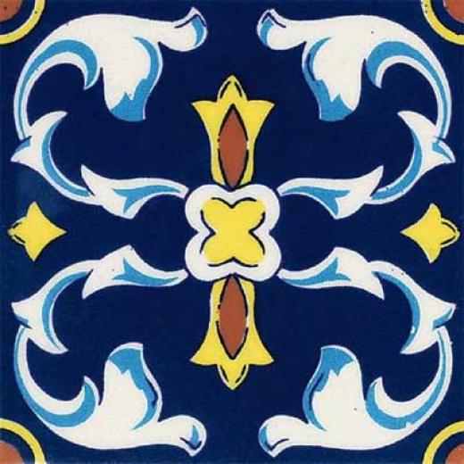
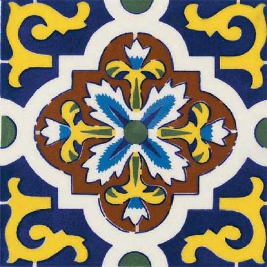
Spanish Colonial tiles.

Roofing is provided by the familiar red clay Spanish roof tiles.   This style develkoped to make use of economical and available materilas, to keep one out of the sun as much as possible, and to allow cross ventilation between the courtyard, through the one room deep perimeter and the outside.  The style also provided privacy and security.

Friday, June 17, 2011

6/20: My Interior Design Hopes and Dreams

As an architect, my education focused on designing buildings as a whole and did not deal with a building's interior surfaces, materials or furnishings.  My Interior Design courses have revealed a new world to me.  A world of vibrant color, textures and new materials such as fabrics, paints and countertop materials.  I hope my studies in interior design will make me a more sensitive and versatile designer.  I dream of applying my new knowledge and appreciation to my own house and to the spaces of others. 

I see myself, after retirement from my project management career, either joining a small firm or starting my own one-person business and combining architectural and interior design skills to provide excellent small scale design.


6/15 Thoughts on Texture

Everything has texture - some materials more than others.  I believe the best use of texture is when textures are contrasted with each other.  Say rough and smooth, flat and bumpy, and so on.  This enhances each individial texture by contrasting it with something different. 


Here, for example, the rough texture of the large stone contrasts with the flat mirror-like surface of the water it holds in the center, with the round, smooth pebbles that surround it.  The rough boulder, the reflecting water and the polished pebbles, all stand out more because of their contrast with the other two elements.  If each was by itself, they would not appear as attractive or intriguing.  The uniqueness of each texture is enhanced by its contrast with the other two, very different, textures.  As a designer, one can enhance the environment one creates by the use contrasting textures that "fit" well together as the ones pictured here do.

6/13 Element or Style or Design Period You Really Love

One style I admire is the bungalow style as exemplified by the Green Bros.  The bungalow style resulted in attractive, affordable houses many of which are still in use today ansd much sought after because of their modest size, sense of proportion and exquisite exterior and interior detailing.  Very different from today's houses which tend to be much larger and devoid of artistic flair.

The use of deep overhangs and porches or verandas created relaxing outdoor family spaces. The entrance via the porch is usually framed by a pair of columns which help define the entrance space.  Beautiful wood and stone work often highlighted by metal decoration enhances the interior spaces. 

Exterior photos of The Gamble House

View of Gamble House in Pasadena, CA.  Note Deep roof overhangs, use of wood, landscaping and house merging into one.

Dining room > interior photos of The Gamble House

Brick, tile, glass, wood, patterned rug and the golden California sun join to create a radiant dining room.


Exquisite wood detailng and craftsmanship on stairway evoke a Japanese feeling.  Stained glass windows in the background filter the light.

Wednesday, June 15, 2011

6/8/11 The Direction of my Portfolio

June 15, 2011                                                                                            Jean Band
In-Class Assignment:  Portfolio Development

1. What is the purpose of your portfolio?
I plan to develop a “master” portfolio that will collect all my work, student and professional. The purpose of the “master” portfolio will be to collect and preserve in one location, my work. The other portfolio will be assembled from the master portfolio and will be event driven:  If going for a job interview, it will collect pertinent examples of work done.  If it is for a meeting with a potential client, it would contain examples of work like that contemplated by client.
2.      What do you hope to achieve with your portfolio?

I hope to have all my work in one place, and then to use it for job or client interviews.

3.       Who is your intended audience?

a.       Potential employers.
b.      Potential clients.

4.       What do you want your portfolio to convey?

Professionalism, variety, be an example of good visual design in itself.

5.       How can having a digital portfolio help you?

Much of our school product is electronic.  An electronic portfolio will help organize it and establish a collection point for it.  A digital portfolio also makes it easy to e-mail portions of it to potential clients. 

6/6/11 My Thoughts on Color

Color suffuses our world and needs to be part of every design effort.   Too many times design is obviously done in monochrome or black and white and color is an afterthought.  Color should not be applied after the fact but should be considered during design.  Use media that allows the use of color during the design process.  For example, use color pencils as well as the customary graphite.  This will lead to a richer and more vibrant design product.

Favorite color:  Blue. 

Monday, June 6, 2011

6/1/1 My Design Philosophy

My design philosophy, to quote the venerable Mies van der Rohe is somewhat "less is more."  I like clean lines, not too much ornamentation, basic shapes.  For example, I like Scandinavian furniture and do not usually like Rococo and Baroque styles which I consider too fussy.

Good Design is design that solves the problem at hand in an economical, efficient and attractive manner.  It respects and fits into the environment it finds itself in.

Wednesday, June 1, 2011

5/30/11: Three Elements or Principles of Design

Rhythm
The repeated quadripartite arches create a pleasing rhythm as one looks down the corridor.  They break up an arched ceiling that might otherwise have resulted in a less pleasing tunnel-like effect.


Focal Point, Contrast
The arched double door at the end of the hall draws your eye and provides a focal point for your eye to rest on.  The sunlit swath of green beyond the glass contrasts with the shaded white of the walls and arches.


Scale, Proportion  While the arches in the corridor are at a very human scale, appropriate to the people walking down the hall, the fresco on the nave wall is monumental in size - not human scale but appropiate for the much larger space of the chapel that it decorates. 


The window treatments in the chapel are also outsize, at least 30 feet in height, but the right proportion for the tall space they are in.